Major project
‘Minimising the sex data gap and the effects of ‘Yentl syndrome’… [Read more]
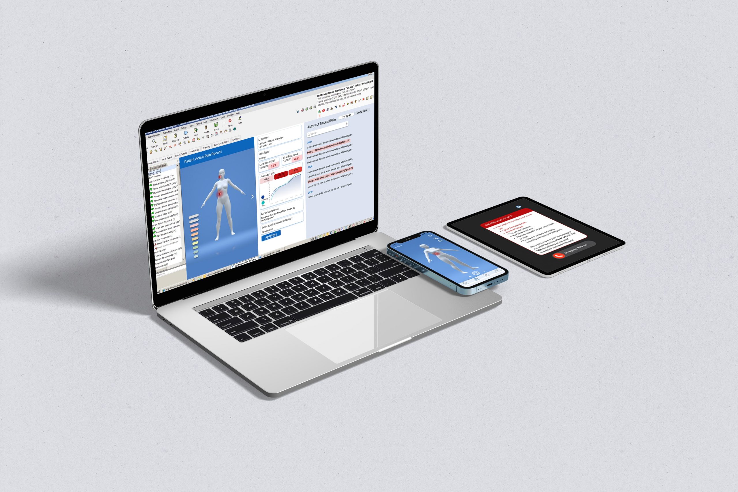
Yentl- a symptom assessment app for patients and doctors.
Yentl is an app for patients and doctors, who want to improve the communication of pain symptoms between each other and before medical appointments to improve the accuracy of diagnosis by reducing both data and human bias, and removing the subjectivity in the doctor's diagnosis decision process. Yentl does this by allowing patients to express symptoms through an interactive approved healthcare template that utilises an intuitive, precise 3D model. Users have the option to track their symptoms over time or link the symptoms tracked to an upcoming appointment that will aid accurate medical diagnosis that is based on their relative pain thresholds bespoke to each patient.
The Challenge
“Yentl syndrome” is used to describe a woman presenting their symptoms to a doctor that are atypical compared to male symptoms — this often leads to misdiagnoses, mistreatment, or being told ‘it is all in their heads'. This along with a distinct lack in sex disaggregation within medical data sets results in women being 50% more likely than a man to receive the wrong initial diagnosis of a heart attack. This project aimed to minimise the gender inequality within the diagnosis system, new opportunities for innovation may benefit both sexes and decrease the prevalence of the disease worldwide.
User Research
In-depth contextual research was conducted to gain deep qualitative insights about experiences within Heart Health Care within the NHS. The research undertaken focussed on both receivers and providers of healthcare to get a balanced overview of the current problem areas:
• Survey - Using a survey the researcher was able to target how the NHS is being utilised by patients, their pain points of the current service and compare stances of the two genders. The survey also strived to establish whether atypical Heart Attack symptoms were recognised by female participants.
• Semi-Structured interviews – 3 different sets of Semi-structured interviews were undertaken to gain insight on the Prevention, Diagnosis and Aftercare experiences in Heart health. These were carried out remotely through Teams and involved Card Sorting and Artifact analysis for further insights.
• Artefact Analysis - The researcher incorporated this research method into the semi-structured interviews, with each participant being presented their heart age via the NHS Heart Age Tool. Reactions, call to action and participant trust were questioned to explore the efficiency of the tool.
• Card sorting - In the context of this research, the researcher looked to establish how different participants related to diet and lifestyle to a ‘healthy’ or ‘unhealthy’ heart. The participants were asked to sort the cards virtually into two categories: Healthy heart or Higher Risk of a Heart Attack.
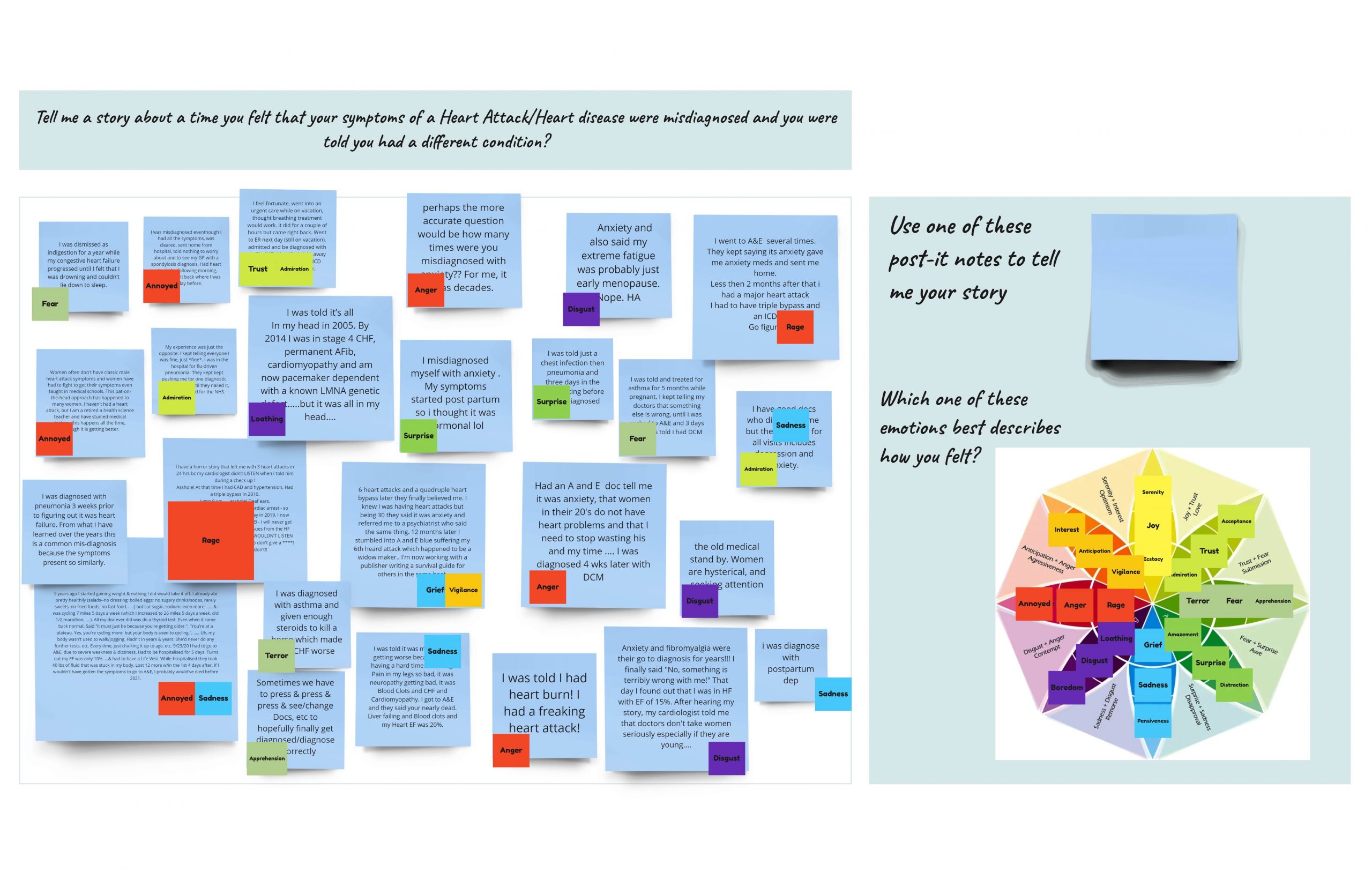
• Graffiti wall – Anonymous users were asked to ‘Tell me a story about a time you felt that your symptoms of a Heart Attack/Heart disease were misdiagnosed, and you were told you had a different condition?’ and use an emotion to describe how they felt when experiencing this.
Affinity diagrams were used to analyse the collated raw data and establish the key findings and insights.
Key Insights and Opportunities
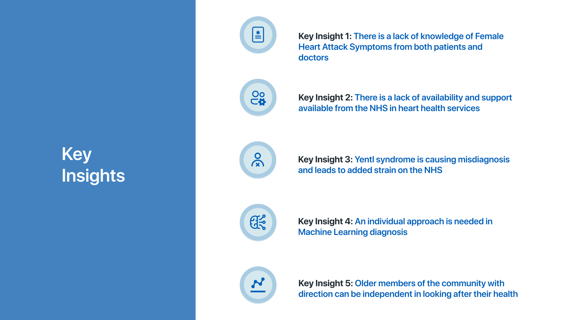
Having collected and prioritised the findings from the different affinity diagrams, five key insights were established. These were based on the prevention and diagnostic opportunities within the problem area. Some key takeaway quotes at this point were:
'You tend to have to ask for things at our doctors they don’t sort of invite you for things.'
'Women are often expected to deal with the pain that perhaps isn’t a normal level of pain and therefore may not go to the doctor quick enough for more serious diagnosis due to expectations of being turned away.'
These insights were all taken forward and considered into the ideation stage of the project.
Design iteration
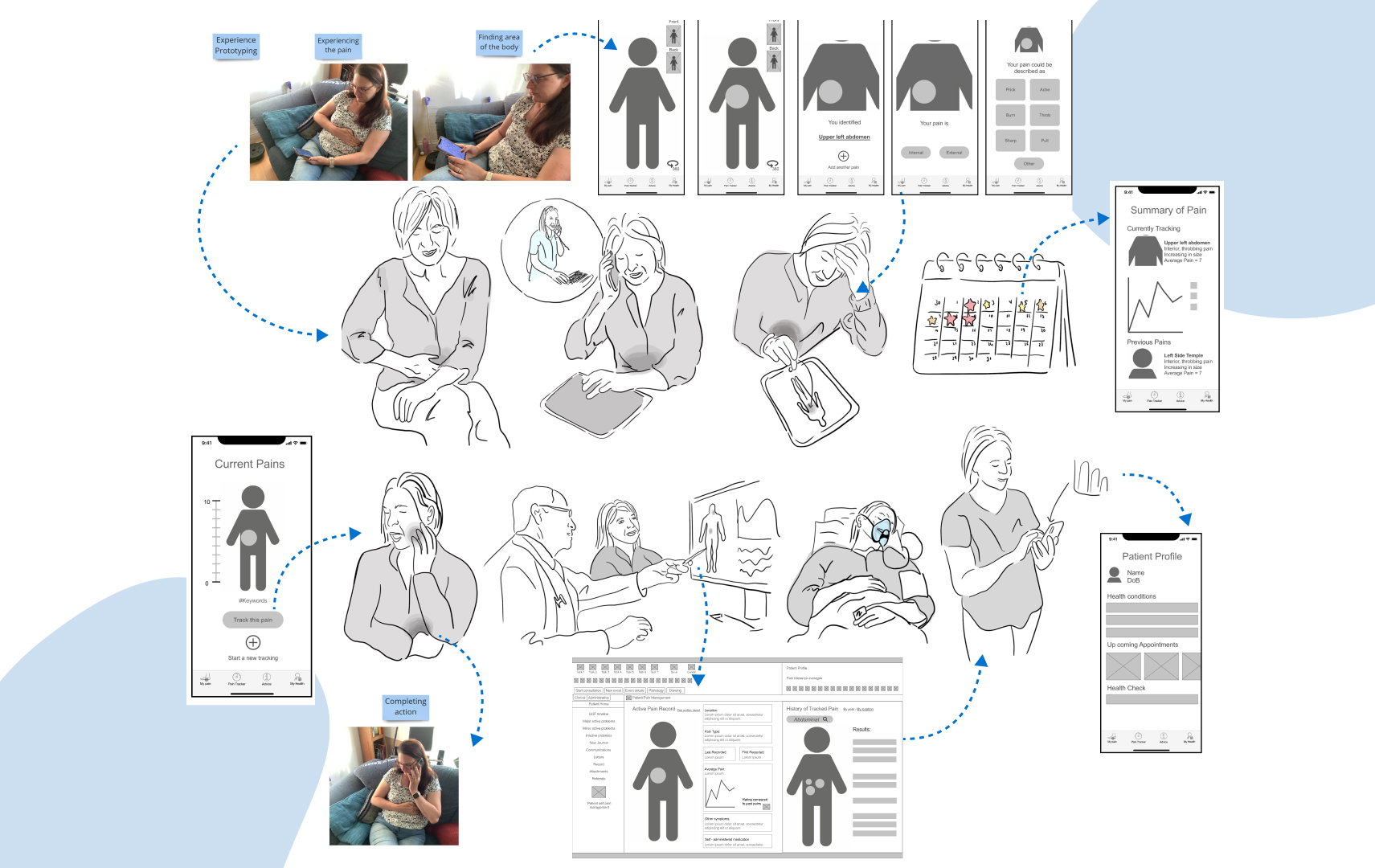
Insights were turned into opportunity statements and “How Might We?” questions were generated to think of divergent solutions to the issues. 80 initial solutions were created through the Crazy 8 method. These were consolidated using an opportunity matrix and an initial concept was expanded to include key features and design principles. A co-design session with 6 users helped refine the idea further. Card sorting and the Moscow prioritisation method were used to finalising features and user requirements. Body storming and experience prototyping were used to explore the way the new service would be used and any barriers to access. Low and medium fidelity prototypes were created on paper and on Figma and these were tested with users through Marvel. After iterating these lower fidelities a high fidelity prototype was created and tested with users through Think aloud testing, to explore the satisfaction and performance of the model. This was then iterated a final time to create the final solution.
Introducing Yentl
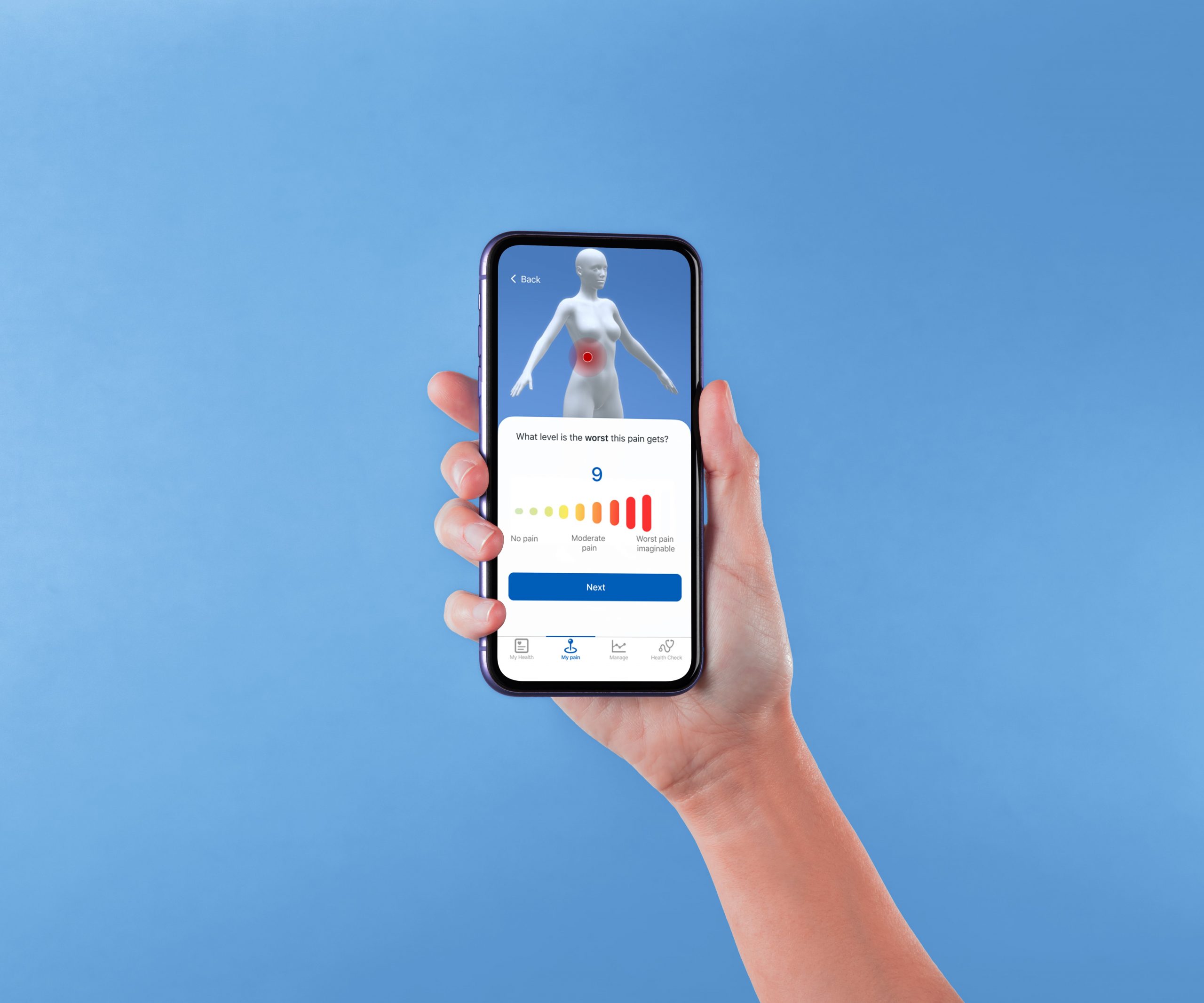
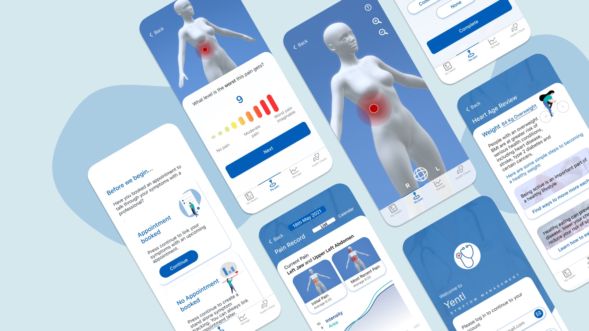
Having improved the initial hi-fidelity model, the final version of Yentl was created. It was comprised of 3 main user journeys on the patient side that focused on answering the target users needs and requirements:
• It relieves the anxiety of appointments.
• Increases the confidence in relaying symptoms.
• Creates opportunity for faster diagnosis of underlying issues.
• Reduces strain on Doctors and the NHS.
Results of testing
Having completed the final prototype the second round of testing was undertaken to test the satisfaction of the final product. The satisfaction was improved and the feedback was clear that the solution was a meaningful one, in many ways that exceeded its initial goals. For less verbal patients this solution gives them a new way to communicate their pain:
'My son has learning difficulties and sometimes struggles to communicate where he is hurting through verbal speech. A tool like this would be amazing for him where he could point to his pain and put his fingers up to show how much it hurt - would make our nurse appointments much easier'
And within 'the new normal' of COVID19 the NHS has been overwhelmed by the pandemic leading to many more phone call appointments, with minimal chance for in-person communication. A solution like Yentl could not only help with in-person diagnosis but could work as a tool to express symptoms when you are unable to show them in real life. Working online in a virtual world, the health care industry will require more diagnostic tools to work remotely from their patients.
Doctors screens
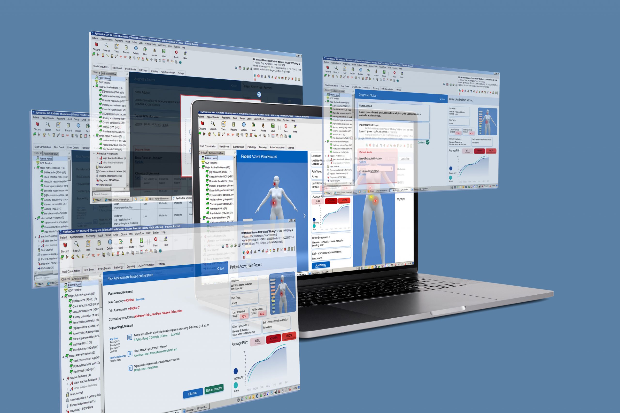
The unique part of Yentl that was created to minimise misdiagnosis, was the built-in risk assessments that are backed by literature for the doctor to access. Having made their diagnosis, if there are any major conditions that should have been considered the Doctor receives a warning and can see the evidence as well as the predicted risk factor of the condition.
They are also able to see the patients history of illness visually, seeing fluctuations in pain, or reoccurring pain areas, helping them to make connections and diagnose underlying issues faster.
The future considerations of this project would be to put the solution to the test within the health care industry as well as understanding and working towards creating a large and inclusive risk assessment catalogue that would act as the basis for the diagnosis within the app and Doctors screens.
Please view my Youtube video for a better understanding of how the Yentl service works.
Lizzie Hart
Hi I am Lizzie, a User Experience Designer that craft's meaningful stories and solves real world problems through visual design and empathetic research.
I am an enthusiastic and creative individual who seeks to design to support a better future for people and the planet. Throughout my Master's course, I have aimed to encompass these ideals in all I do, from creating sustainable energy solutions to improving access to health care, reducing the impacts of fast fashion or improving the accessibility of education to low-income areas, I strive to design for a more inclusive holistic world. By empathetically seeking to understand users pain points and needs through thorough research, I am able to put the users at the core of my process. By enhancing my storytelling techniques over the past year, I am able to engage with a variety of stakeholders to communicate problems in an engaging and powerful way. I hope to be able to utilise these skills and others as I progress into employment, aspiring to become a User Experience Designer working within Service Design.
Major project
‘Minimising the sex data gap and the effects of ‘Yentl syndrome’ in women’s cardiovascular health’
Work Experience
During my Masters year, I worked as a User Experience Design Intern for a small beauty brand - Astr0 Beauty. I was responsible for running Usability and Accessibility tests on the e-commerce site and adapting the site for optimum reach. As well as creating customer journey maps to establish the customer touchpoints and barriers to the service. It was exciting to work within a newly founded business, offering advice in an area the business hadn't previously considered.