Major project
Reducing digital pollution through a greener use of digital devices. [Read more]
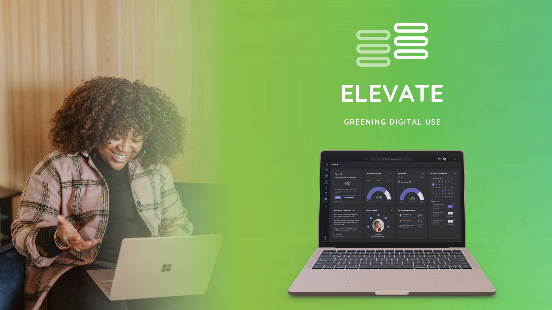
Elevate is a plug-in that helps users reduce their digital carbon footprint.
Elevate is a plug-in for Microsoft Teams (or other business communication platform) that empowers company employees that use a laptop for work by providing clear tools to reduce their digital pollution in a convenient, impactful and practically effortless way.
The Challenge
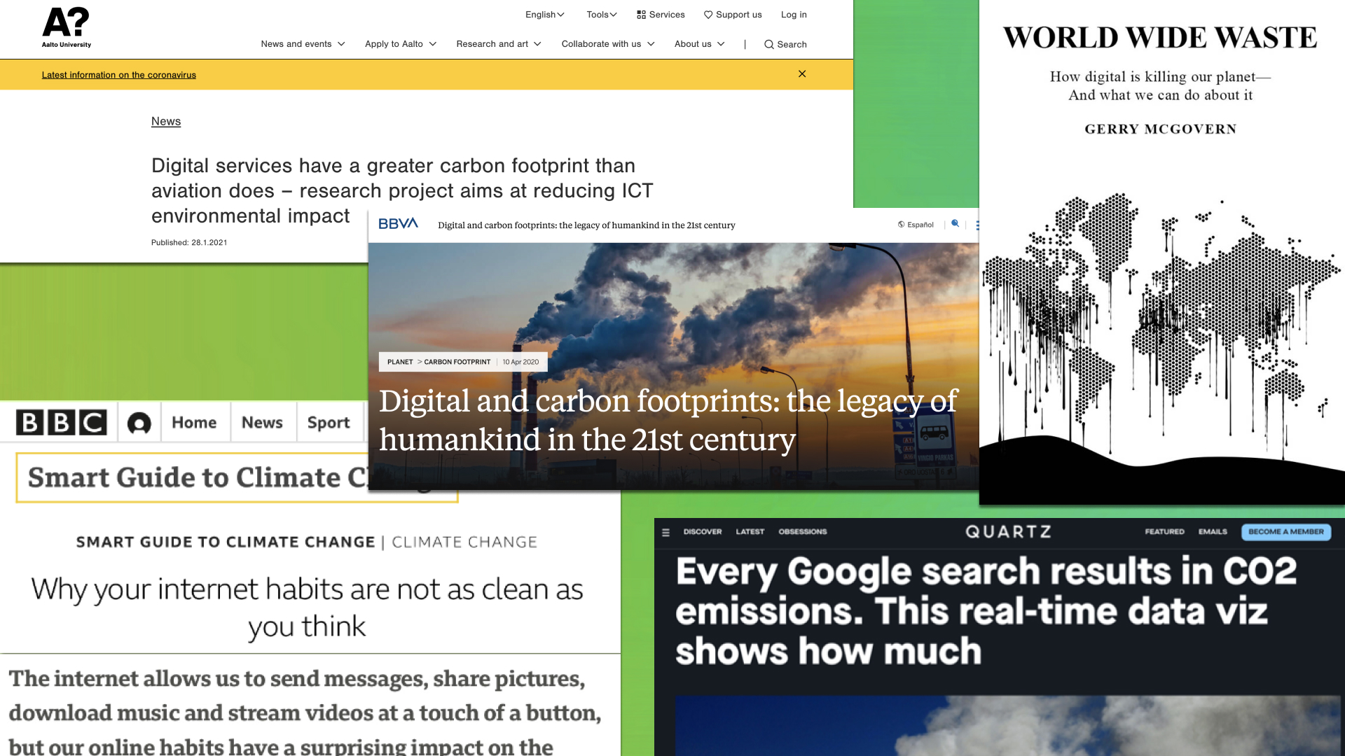
Did you know that every search performed on Google, every Netflix show watched, every file stored in the cloud creates pollution? This is because these actions trigger servers to process and output data and then more servers to transmit it, consequently consuming electricity and burning fossil fuels.
Given this issue, the aim of this project was to better understand the use of digital devices, apps and power of digital natives, as well as their awareness of their digital carbon footprint, in order to design a solution that encourages more sustainable use of digital devices.
User Research
Primary and secondary research was conducted to explore the use of digital devices, applications and power of digital natives, as well as their awareness of their digital carbon footprint.
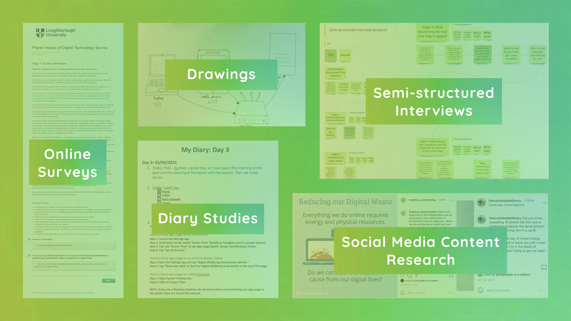
Methods included:
• An online survey where 112 responses were collected to understand the limitations of current solutions from the users’ perspective, their device usage and motivation/demotivation to behave in eco-friendly ways.
• A drawing activity with four participants to understand their mental models of how the Internet functions.
• Social media content research on Instagram and YouTube to discover users’ knowledge on the digital pollution problem.
• Eight four-day diary studies that asked users to document the devices and apps used on a day-to-day basis and what they were feeling before and after seeing their device and app usage. This served as a basis for the semi-structured interviews.
• Eight semi-structured interviews with digital natives aged 25-34 to find out the ‘why’ behind the diary study data. Participants were presented with a list of ways to reduce digital pollution and asked to assess the easiness with which they would be able to introduce these in their lives as well as the degree of impact they could have on the environment.
A key quote from the user research was: 'I'd like to reduce my digital carbon footprint but what are the things that can really have an effect without making my job more difficult?'
Key Insights
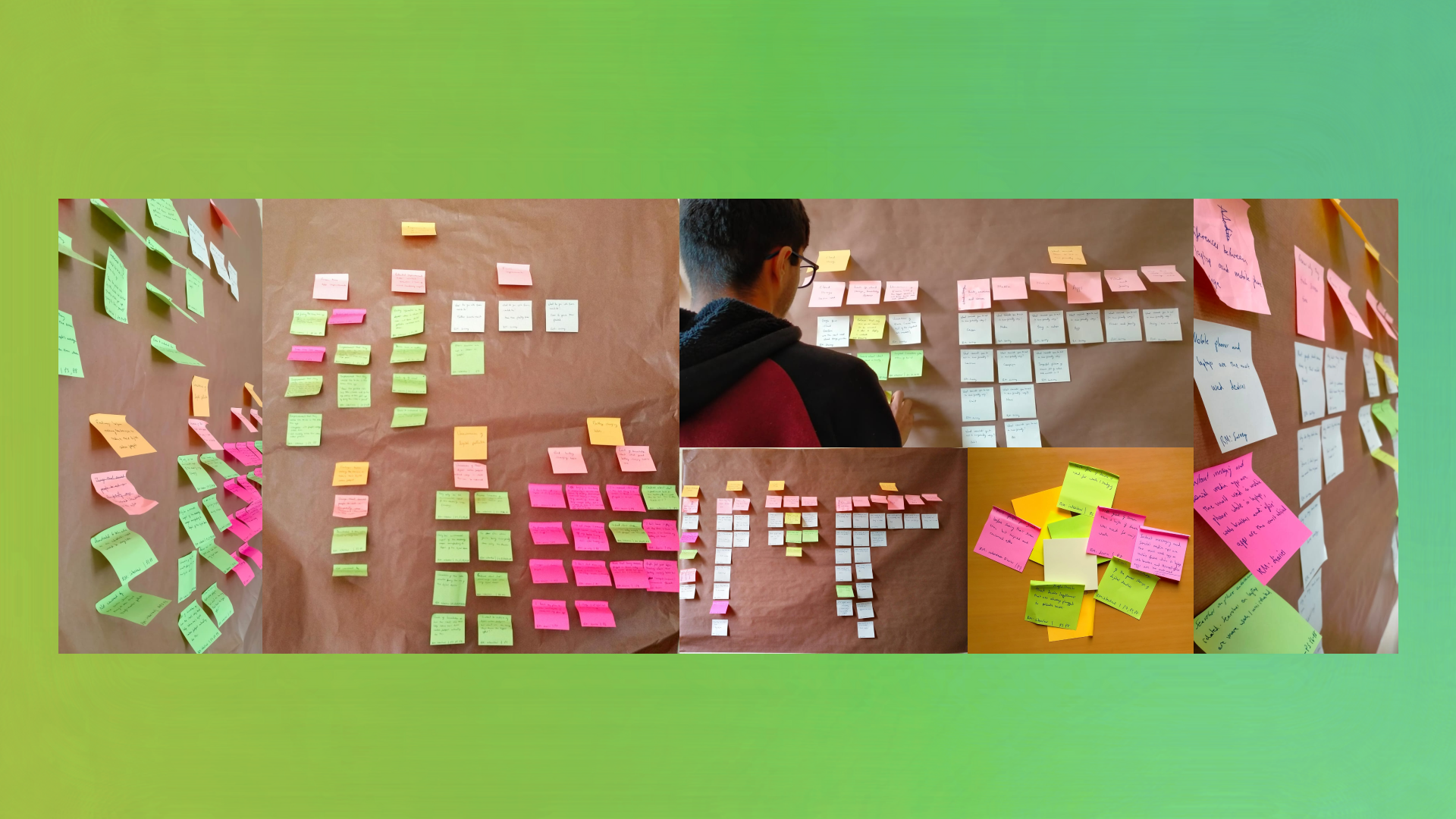
Data was collated and analysed using statistics, thematic analysis and affinity diagramming. Key insights included:
• Unawareness of the digital pollution problem as no visual feedback depicts how the use of digital devices is polluting, making them feel powerless and confused regarding how their digital carbon footprint can be reduced.
• Users spending unhealthy amounts of time in front of screens, causing worry about their eye health as they cannot find the way (motivation) to cut it down as they are currently studying or working remotely.
• Users are only willing to take actions that they know how to do and require little effort to reduce their digital carbon footprint as their motivation is not enough to sacrifice convenience.
Ideation
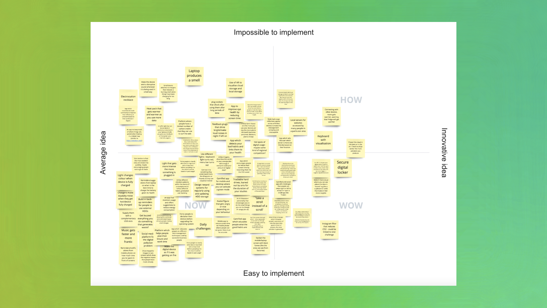
Insights were turned into ‘How Might We?’ statements and evaluated using an opportunity matrix to identify the ones with the highest potential for improving the user experience and addressing digital pollution. These were then used for individual ideation, where various techniques were leveraged. Two co-design with six and five participants were organised to help keep users at the heart of the idea generation process.
The initial concept was chosen by using the ‘How? Wow! Now’ matrix and evaluating the most promising ideas against the experience goals. Further secondary research was conducted after listening to a podcast on a current solution: Digital Clean-ups shared by Dr Val Mitchell.
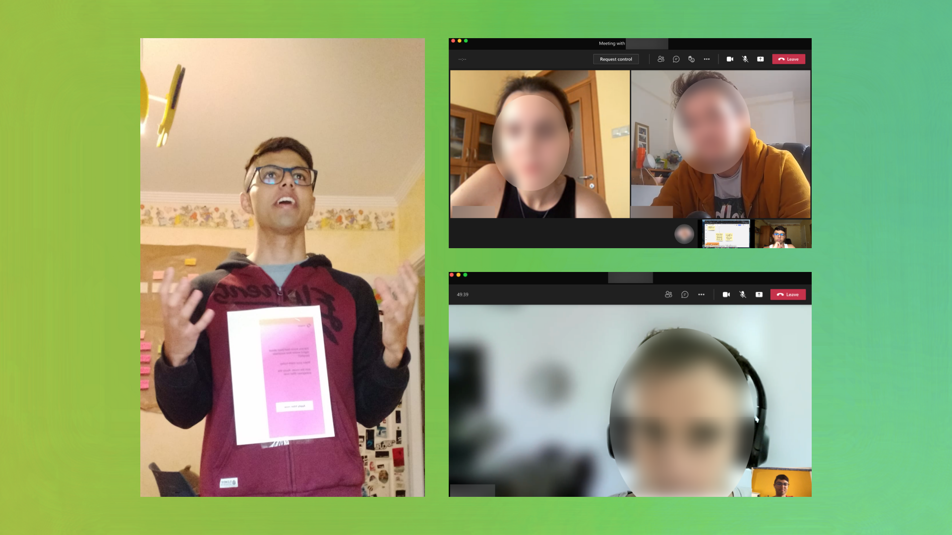
Initial Concept Testing and Co-design
After bodystorming and two user testing sessions, the initial concept failed to address some pain points. Luckily, one of the user testing sessions turned into a co-design session where users provided a new concept idea that the designer elaborated on: Elevate. To evaluate and prioritise features and user requirements, the use case matrix and MoSCoW method were utilised.
Design Iterations
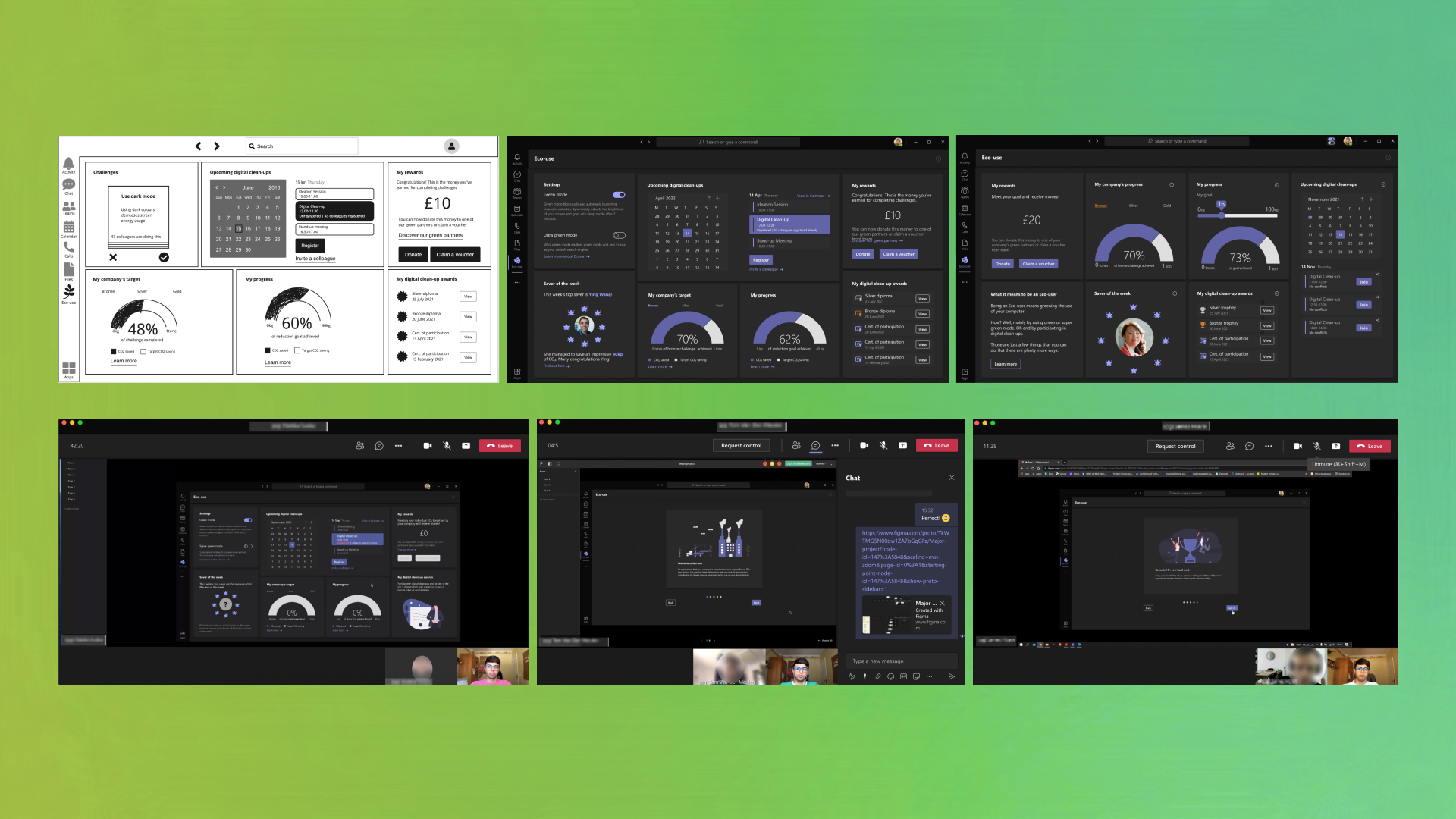
Elevate went through three design iterations where various user testing sessions were carried out for each. The feedback from each session was carefully considered to ensure the final design was user-centred. The first iteration aimed to systematically evaluate if the concept could succeed in a work setting and co-design uncertain features with a low-fidelity prototype, whilst the purpose of the second and third iteration was to assess the usability of the concept with a high-fidelity prototype.
Final Design
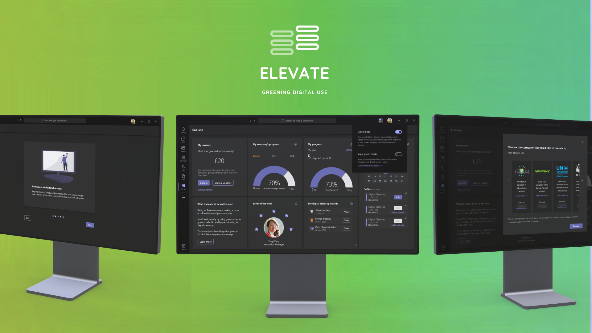
Elevate is a plug-in for Microsoft Teams (or other business communication platform) that empowers company employees that use a laptop for work by providing clear tools to reduce their digital pollution in a convenient, impactful and practically effortless way.
• Elevate informs employees of upcoming digital clean up days organised by the employer where they delete files that they no longer need.
• The plug-in also provides users with two unique modes: green mode and super green mode that they can activate to easily reduce their digital pollution.
• Elevate allows users to set their own goals to reduce their digital carbon footprint and track their progress. When an employee accomplishes their personal goal, they are rewarded with money that they can donate to one of their employer’s green partners (companies working towards net zero emissions) or claim a voucher from them.
• Elevate supercharges the company's motivation to decrease their digital emissions by setting them a bronze, silver and gold challenge (based on the company’s size and industry in which they operate) and rewarding them with a bronze, silver or gold badge that they can easily include in their branding.
• The monetary compensation given to employees for completing their individual carbon reduction goals would be financed by Elevate. Therefore Elevate would act as a social enterprise as a large percentage of the profits from selling the plug-in to organisations would be used to fund the donations and vouchers.
Want to know more about this project? Visit www.maeiniasm.com
Maeinia Saadbouh Montesdeoca
An observant and active listener with a multidisciplinary background and a passion for elevating digital user experiences and conversion rates.
It has been my unfading curiosity and fascination about the intersection of design, technology and business which led me to discover the exciting world of UX design during a university group project. This happened during my time at the University of Warwick, where I successfully completed a bachelor’s degree in Computer Science and Business Management.
I feel incredibly grateful to have studied this master’s degree in User Experience Design. It has not only developed my skills and competencies in both the creative and technical areas of UX, but it has also equipped me to become a socially and environmentally responsible UX Designer. As an individual with high sustainability consciousness, I have drawn great focus throughout the programme to develop solutions like Elevate that aim to make a healthier planet for all.
After completing this highly selective master’s, I have been particularly interested in interaction/UI design, usability testing and conversion rate optimisation (CRO). I am eager to immerse myself as an adaptable, conscientious and creative professional in a diverse technology or experience design consultancy where I can continue to learn and evolve.
Major project
Reducing digital pollution through a greener use of digital devices.
Awards
Best Prototype Award - UXathon 2020 (awarded by Hong Kong and Loughborough University)
UXathon is a one-day real-time UX design challenge where Loughborough design students form UX agencies working for real start-ups created by MBA students from Hong Kong University, mentored by UX designers from the industry.
My team and I designed the website UI, branding, persona, user journey and site map for the OXBUYER start-up and won an award for creating the best prototype.