Major project
Jourlax [Read more]
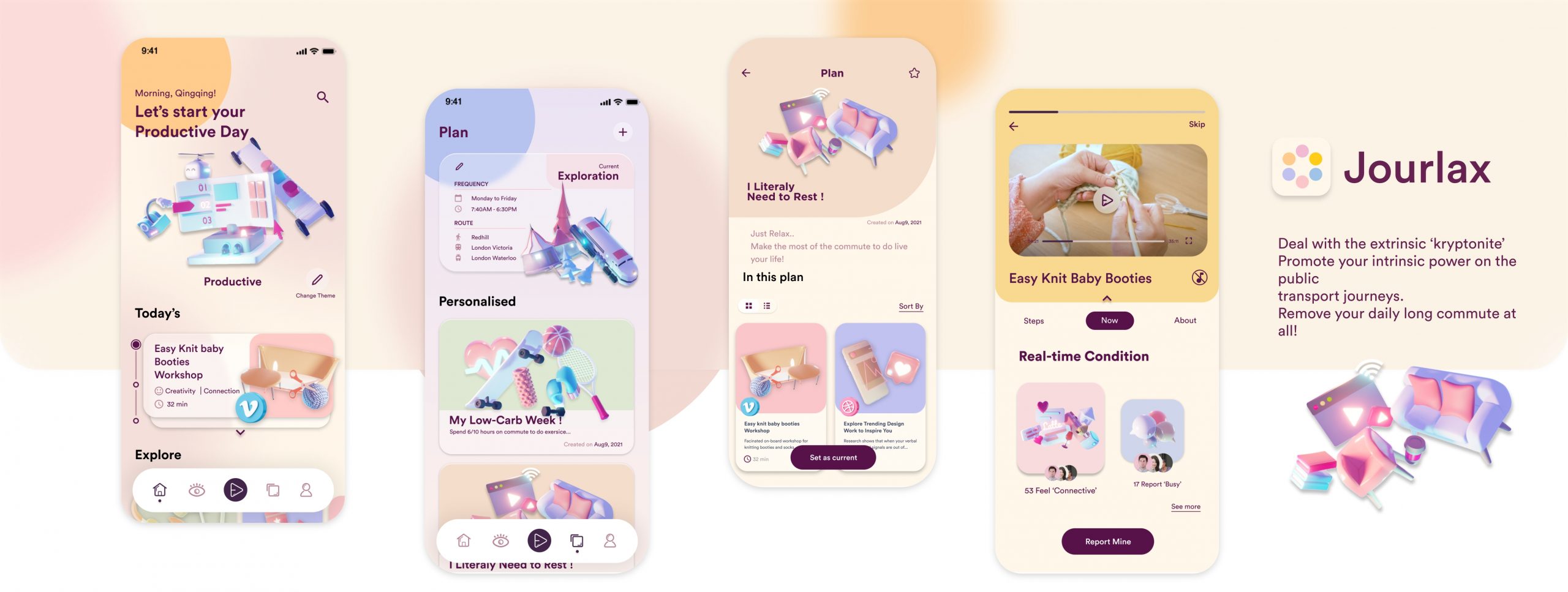
Jourlax is a commute organiser that convert cross-city commuter's conception on wasted time to personal time
Jourlax is a commute-management app embedded with onboard facilities, designed to provide personal assistance to manage their personal tasks and activities by beating them into chunks based on onboard circumstances to achieve their personal, social or professional goals with more confidence and concentration.
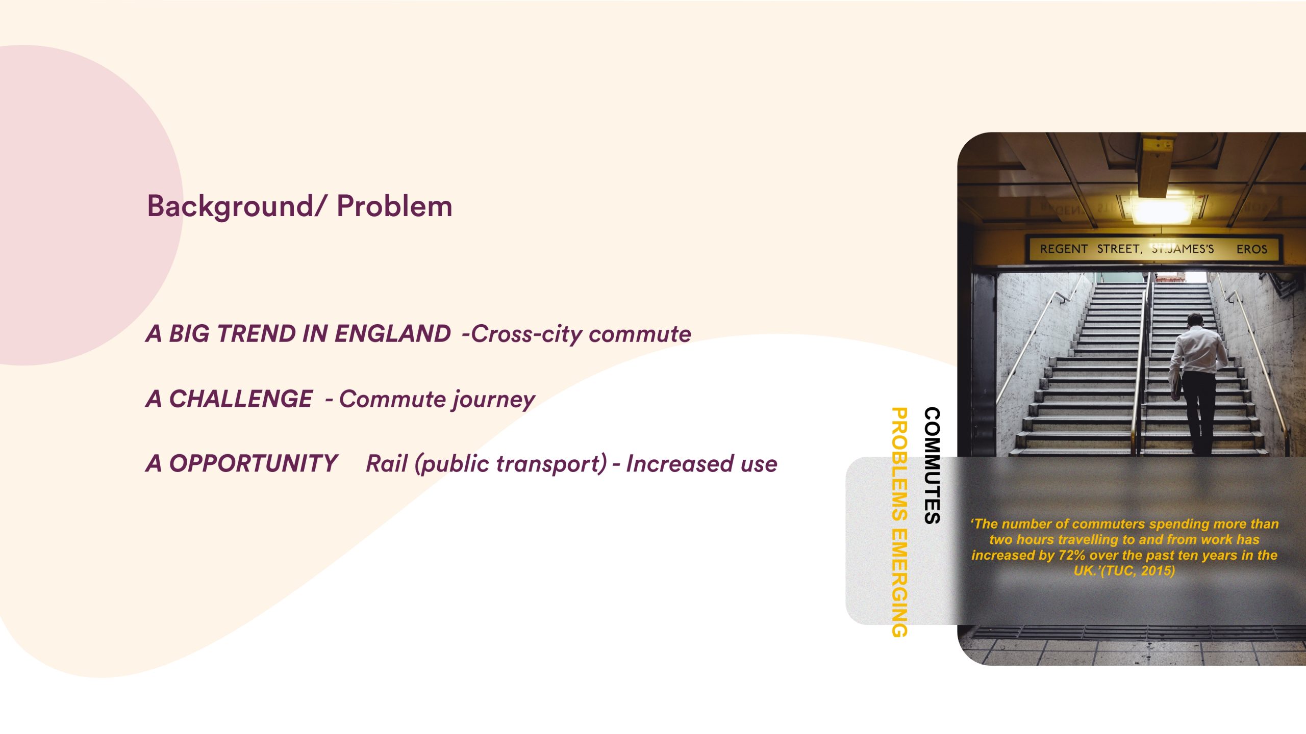
The challenge: Cross-City Commute
Cross-city commute shows a big trend in England. The number of people that spend more than 2 hours commuting has significantly increased over years.
However, problems are emerging as well. It is reported that commuters in the UK are facing problems ranging from traffic congestion to low satisfaction with available space on train service. The additional travelling hours decrease the overall satisfaction and increase the social stress.
This project attempts to explore the cross-city commuters’ understanding of the commute journey and their behaviour in order to generate innovations to improve the commuting experience by a more sustainable and efficient service system.
User Research:
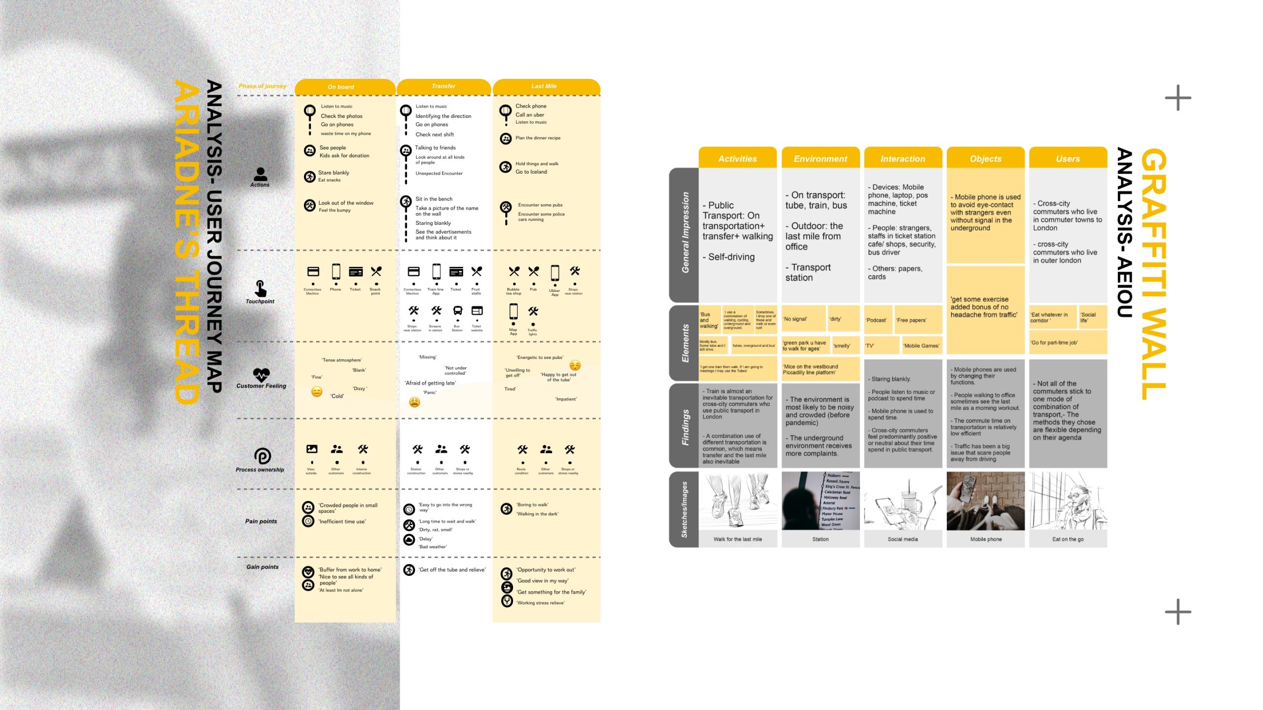
In-depth contextual research was conducted to gain deep insights into cross-city commuter's thoughts and behaviours when using social media.
Methods included:
9 contextual interviews with cross-city commuters, happened before and after the safari method.
6 media scans using youtube videos to code keywords, thematically analyse them to get a general impression on the end-users before conducting primary research.
Ariadne's thread (safari method) is conducted by asking 1 participant about his (her) commute experience (time, route) and navigate on the researcher's own.
Key Insights and Opportunities
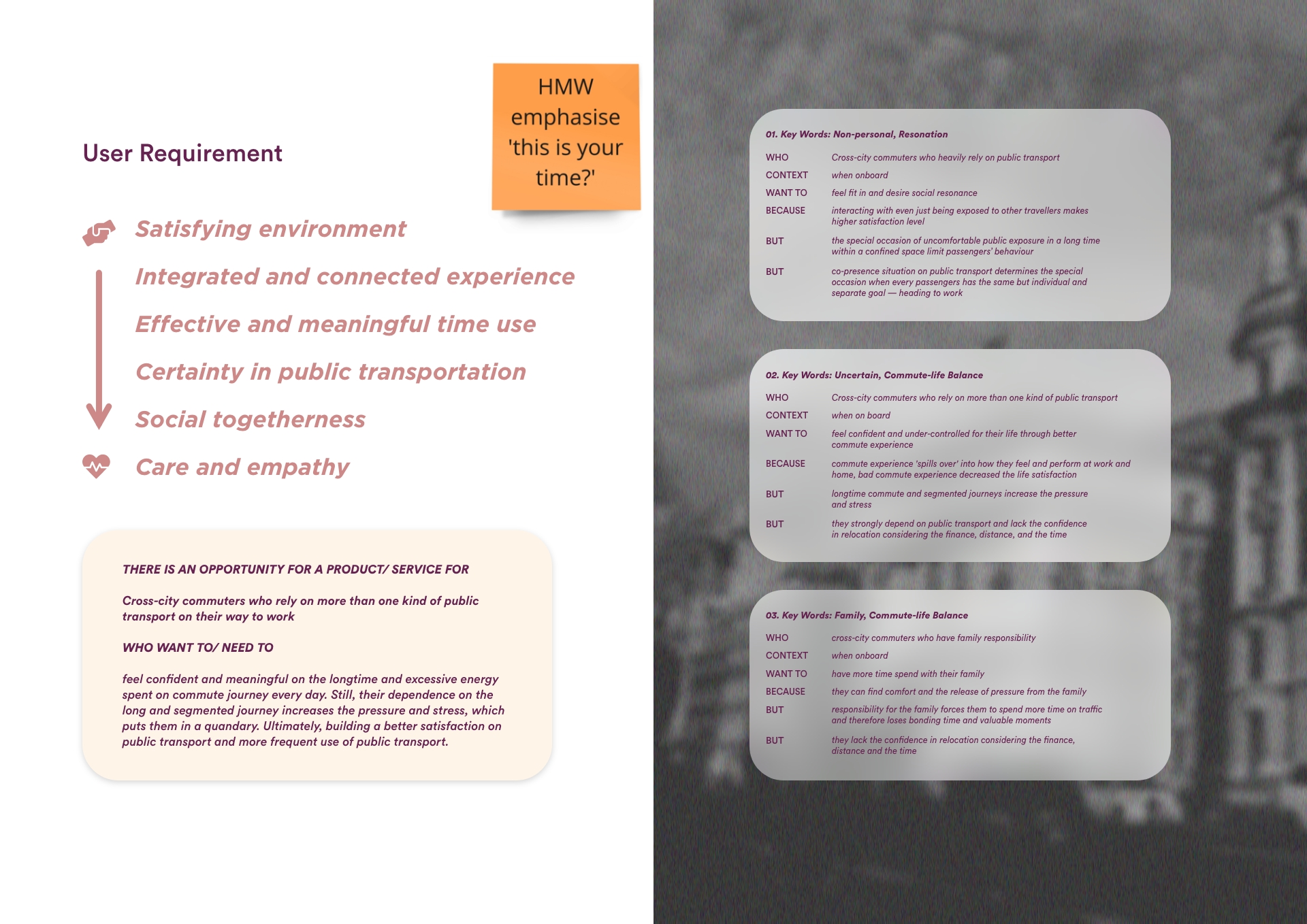
Based on 3 insights, user requirements are concluded from more physical to more emotional:
Satisfying environment
Integrated and connected experience
Effective and meaningful time use
Certainty in public transportation
Social togetherness
Care and empathy
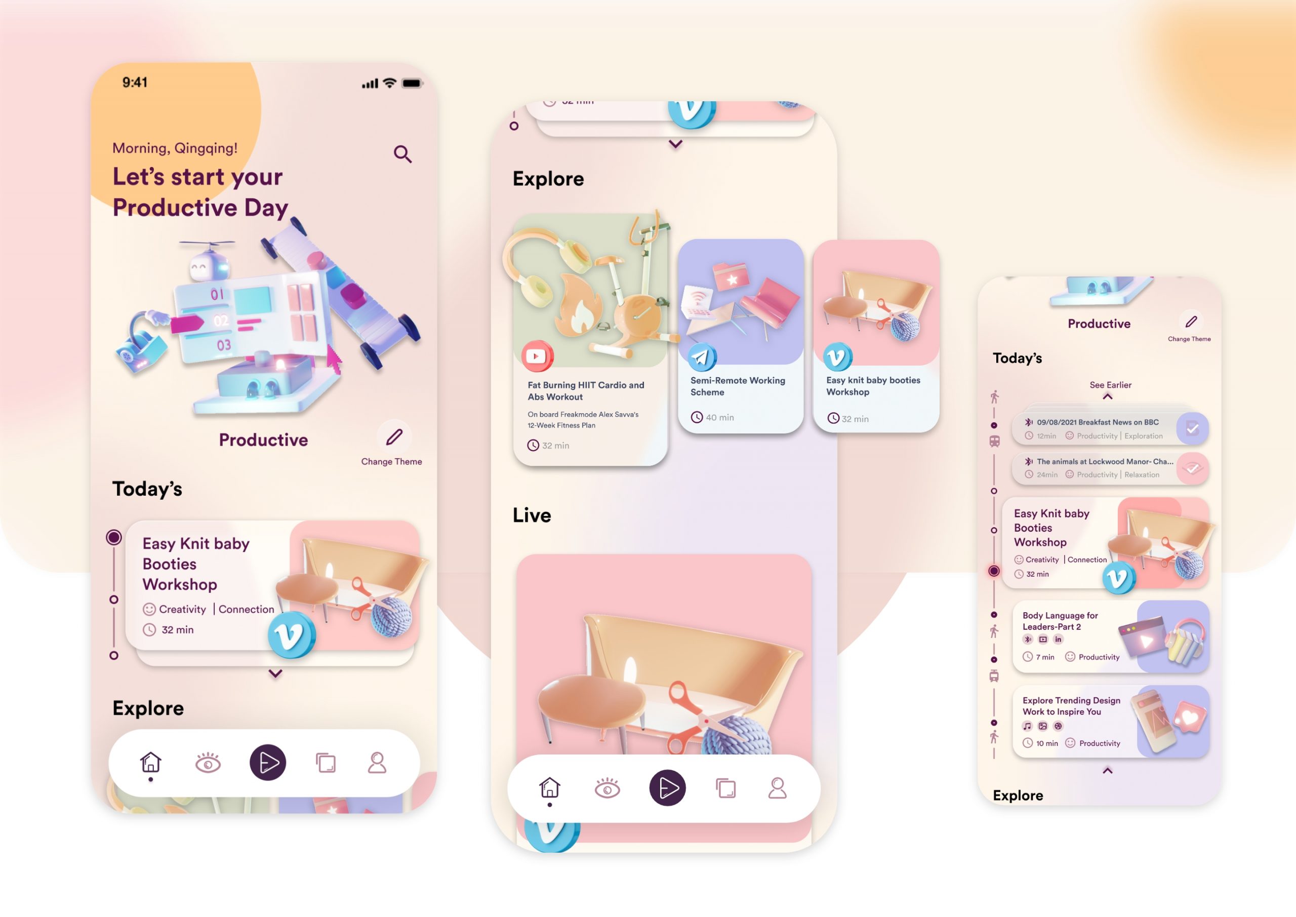
Feature: Homepage
At homepage:
First, the first module on the homepage carries the user-selected theme. When switching, it will show an animation rotating. The opening animation can instantly call up the user's emotional senses and relieve their anxiety.
The researcher conducted a focus group survey and defined the top tasks based on the card sorting results. Then, the second module in today’s activity plan according to the order. When expanded, the users can see the activities been completed, ongoing, and activities and journeys to be done later. This module creates a form of the itinerary. The most important keyword conveyed is a sense of fulfilment, solving the pain points corresponds to the ineffective commuting time.
The next module is the promotion of single activities. Users can see this explore module from the homepage. Lively and jumping colours used can catch their eyes and convey a sense of freshness where the emotional value can retain some resident users. I used cards form to present information. The main content will use larger cards to express differentiation. It also combines with the theme elements to break the traditional design methods from the shape.
At the bottom of the homepage is a live event, which can connect multiple passengers to do an event together, corresponding to the user requirement which is a sense of co-existence.
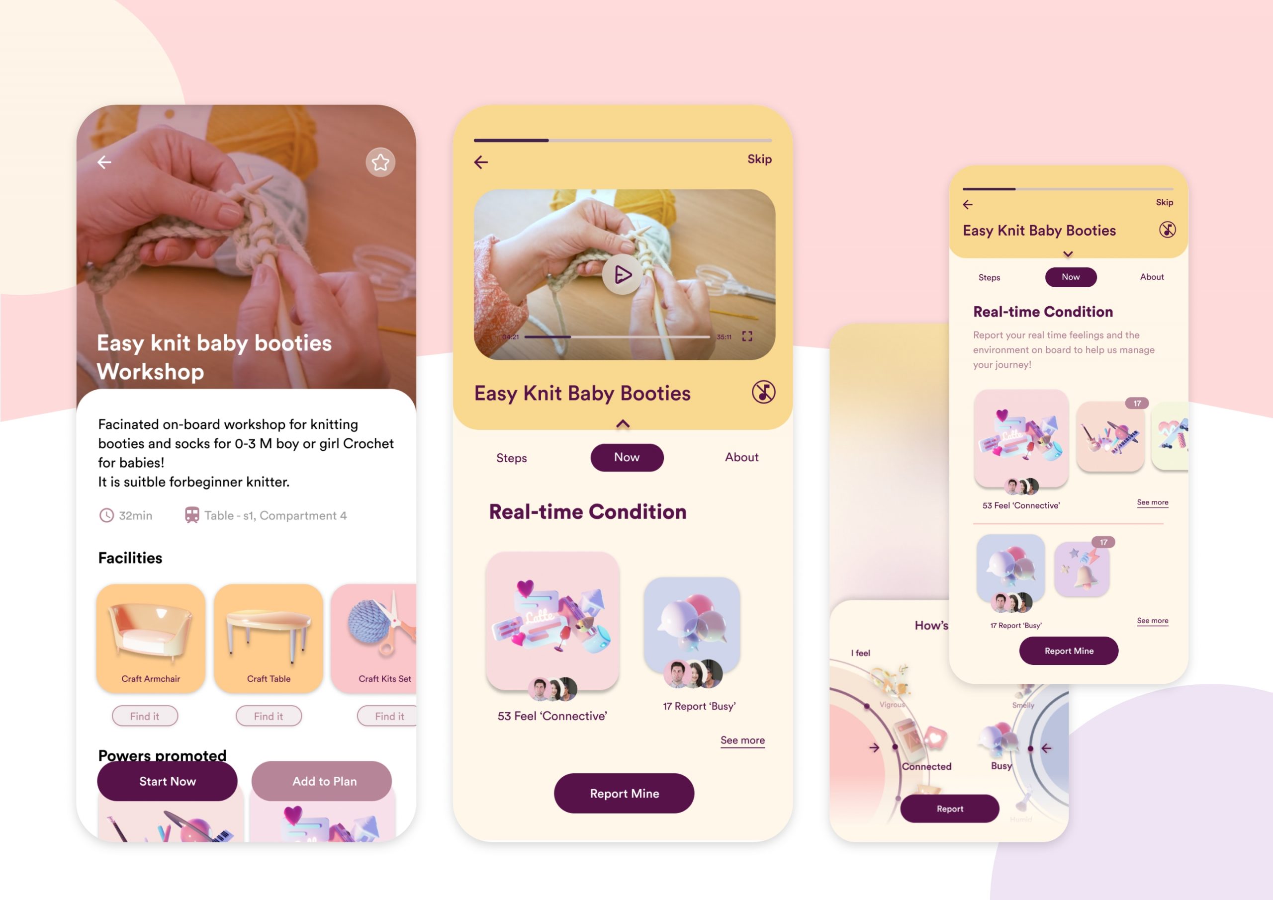
Feature: Activity
Following is the event information screen. The first module carries the media container. It provides energy themes, as well as the environmental conditions that are not suitable for carrying out. I also use the large round corner to convey a soft emotion, visually convey the value of alleviating anxiety.
Next is the activity page. Under the main activity module is the user’s real-time feeling feedback and environment feedback. The designer used a double-circle style to distinguish the emotion and physical condition to reduce the user's understanding cost.
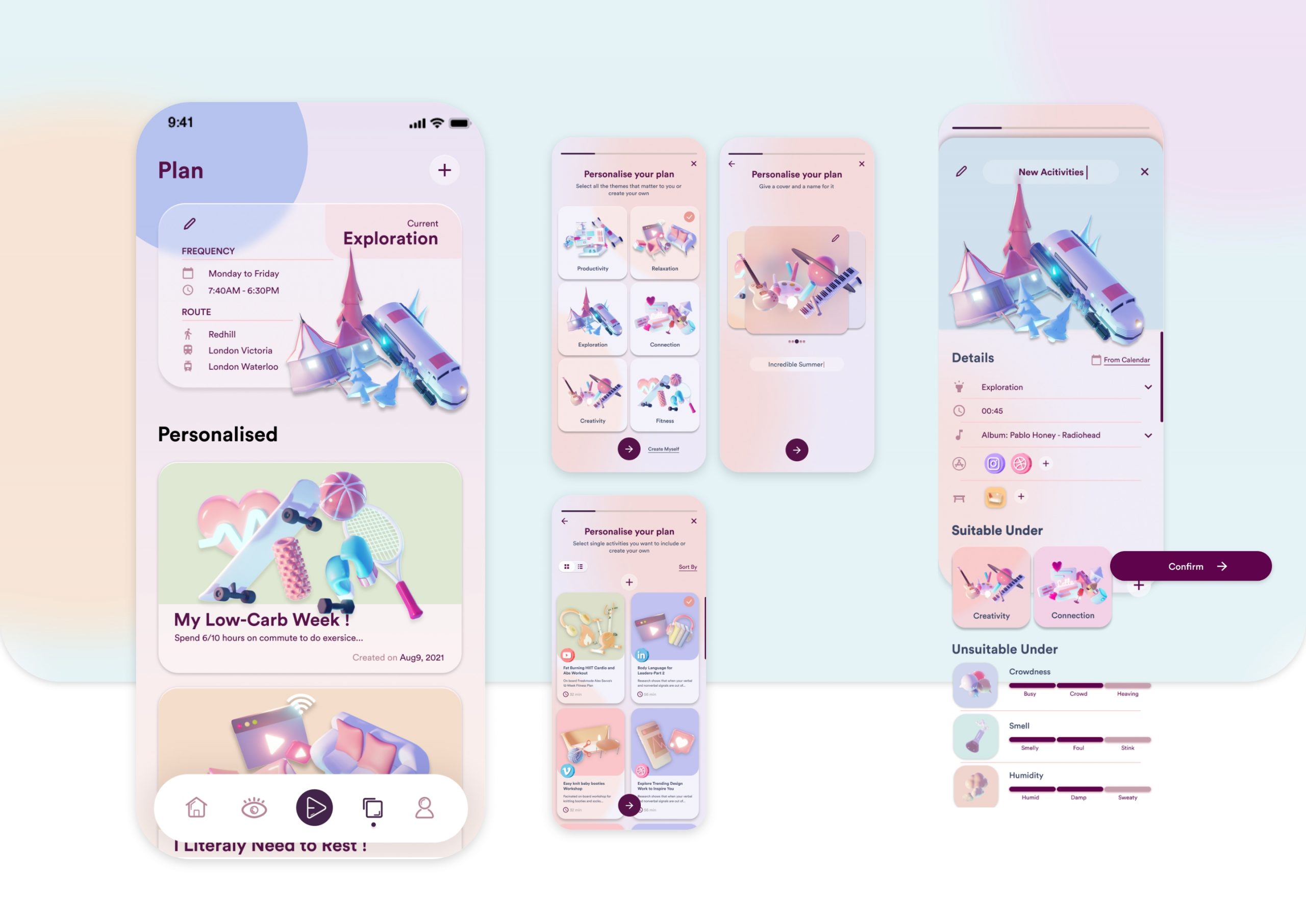
Feature: Current Commute Plan
Allow users to personalise their plans with multiple themes, and create their own activities:
- Link to other APPs
- Import activities/events from your calendar
- Add the ‘kryptonite’ and powers for AI (personal assistant) to arrange them for you
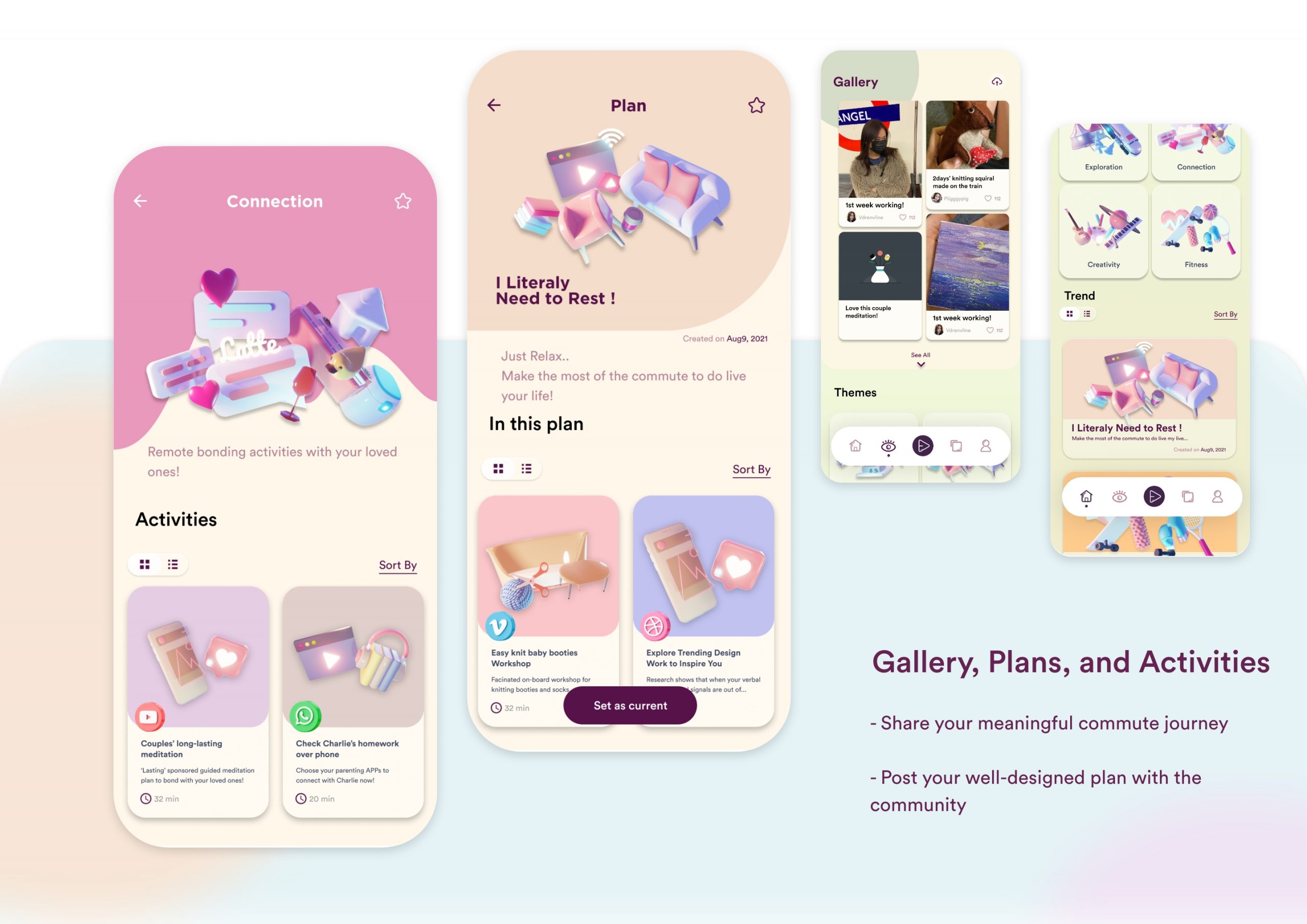
Feature: Gallery, Plans, and Activities
The platform allows users to share their meaningful commute journey and post their well-designed plan with the community.
Qingqing Xu
This project attempts to explore the cross-city commuters’ understanding of the commute journey in order to generate innovations to improve the commuting experience by a more sustainable and efficient service system.
Jourlax promotes to deal with the extrinsic ‘kryptonite’, take advantage of commuters' intrinsic power on the public transport journeys, and remove their daily long commute at all, ultimately, building a better satisfaction on public transport and more frequent use of public transport. This project showcases my ability of user research, experience design, UI design, and visualisation. As a talented and energetic UX designer, I am skilled in UX design methods and comprehensive design visualisation skills, including 3D modelling, seeking to elevate my UX/UI ability in the technology industry.
Major project
Jourlax
Awards
Jul 2021, Project 'Petbulous' been shortlisted by Gename Company smart meter data experience design scheme
Work Experience
Jul 2021 - Sep 2021, Zardite UK Co., Summer Internship
• Completed the redesign of the existed App according to the established App user flow
• Generated the matching screen based on the visual theme of the brand
• Redesigned some interface functions based on APP usability and accessibility theories
• Iteratively redesigned the community, forum and other 7 screens in multiple rounds through communication and cooperation with other designers and engineers
• Improved the quality of being a UX designer in the industry field through UX training from IBM
Jul 2020 - Dec 2020, Sumi Network Technology Co.Ltd., Internship
• Inspected and discovered user requirements, find user pain points, and build the persona by communicating with product managers
• Generated the UX Vision based on user requirements,
• Complete a user journey map with the goal of solving pain points and increasing user loyalty
• Cooperate with the product department to investigate the user’s Top Tasks to complete the user flow
• Generated high-fidelity UI after iterative communication and cooperation with products and front-end developers,
• Completed 3 UI projects related to travel, community and medical care.
Jul 2019 - Sep 2019, Chery Automobile Co., Summer Internship
• Inspected and discovered the targeted users’ requirements and pain points through primary research, given insights, set scenarios, benchmarking, etc.
• Generated personas by negotiating with leaders and teams
• Explored the design themes for the next generation of TiIGGO8 to comply with the market requirement
• Brainstormed the creative forms for exterior and interior design
• Generated a complete conceptual design project for next-gen TIGGO8
• Developed methods of creative thinking for transferring business and product requirements to specific design.
• Improved my visualization skills
• Qualified as a distinct team member